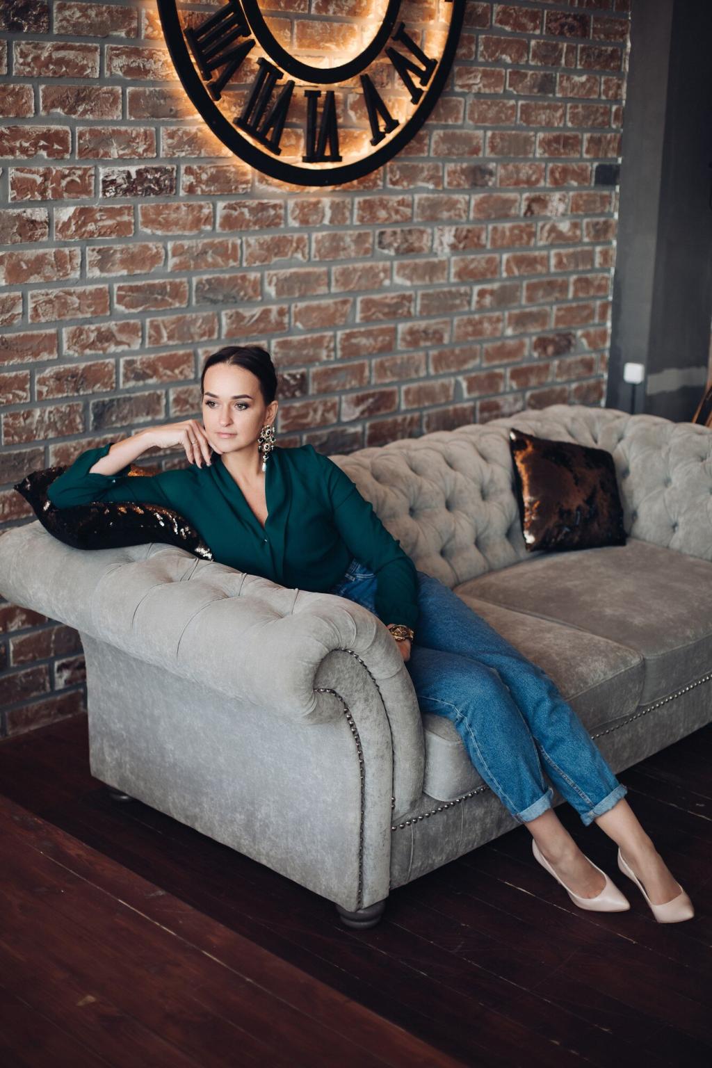

Fabric and Texture: How Color Really Reads
Velvet and chenille amplify jewel tones like sapphire, forest, and merlot, creating a plush, immersive look. The nap catches light, shifting from dark to luminous through the day. If you crave drama without loudness, try a deep green velvet sofa and watch it glow at sunset.
Fabric and Texture: How Color Really Reads
Matte, slubby fabrics diffuse light, making colors appear gentler and more organic. Mushroom linen feels earthy and breathable, while nubby bouclé adds cozy tactility to calm neutrals. Touch matters: encourage guests to sit, then notice how texture tames even stronger pigments into livable tones.
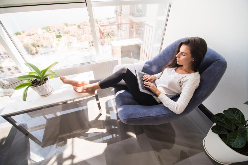
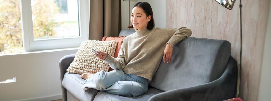
Fabric and Texture: How Color Really Reads
Modern performance weaves resist stains and sunlight better, keeping color true longer. Mid-tones like stone, cocoa, and eucalyptus hide daily wear gracefully. If you host often or live with pets, these fabrics let you choose trend-forward hues without fear. Tell us which performance colors surprised you most.